
How I Used Custom Wallpaper to Define My Entryway (And Finally Make It Feel Like Its Own Space)
My entryway has always been an awkward place in our house. It’s not really a room or a hallway. We’ve tried to define it with our board and batten coat hanging wall that we built when I turned my coat closet into a pantry. I’ve tried to use rugs and random furnishings, but it’s never felt quite right.
The reality is our entry leads right into our kitchen with no visual break between the two spaces. When you walk in, the coat wall is to your right. The stairs to the second floor are to your left, and straight ahead is the kitchen.

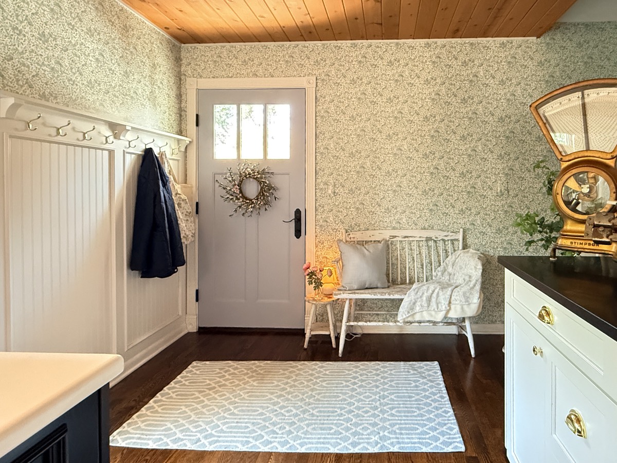
Two fixes changed the room completely. I painted the door and added wallpaper. When I look at the space now, it’s difficult to believe it hasn’t always been this way. It just fits my home aesthetics perfectly, and I’m shocked at how well it defines this space.
On my blog Living Large in A Small House, I may sometimes use affiliate links, which means a small commission is earned if you purchase via the link. The price will be the same whether you use the affiliate link or go directly to the vendor’s website using a non-affiliate link. You can find my full Disclosure Policy HERE
The Plan: Define a Space That Doesn’t Really Have Walls
When I partnered with Love vs. Design on this project, I had a pretty clear vision of what I wanted, something that said, “Welcome to our home” instead of “Hi, you’re in the kitchen.” I wanted some pattern and personality, but nothing so bold that it would compete with my kitchen or my ever-evolving changes that I make to my home.
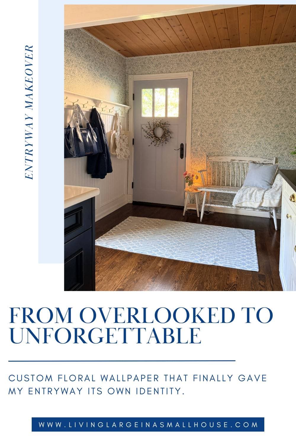
My plan was to paper above the coat hanging wall, wrap around the front door, and continue along the wall up to the corner of our staircase. That run of wallpaper would essentially “draw” the boundaries of the entryway without needing any type of physical structure.
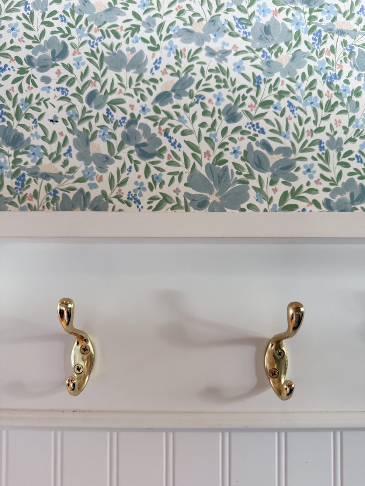
The Paper: Pollinator Paradise
I’ve partnered with Love vs. Design before. I used their peel-and-stick paper in my laundry room, and more recently, I helped my daughter Emma wallpaper her dining room in her downtown Chicago apartment, so I already knew and trusted the brand.
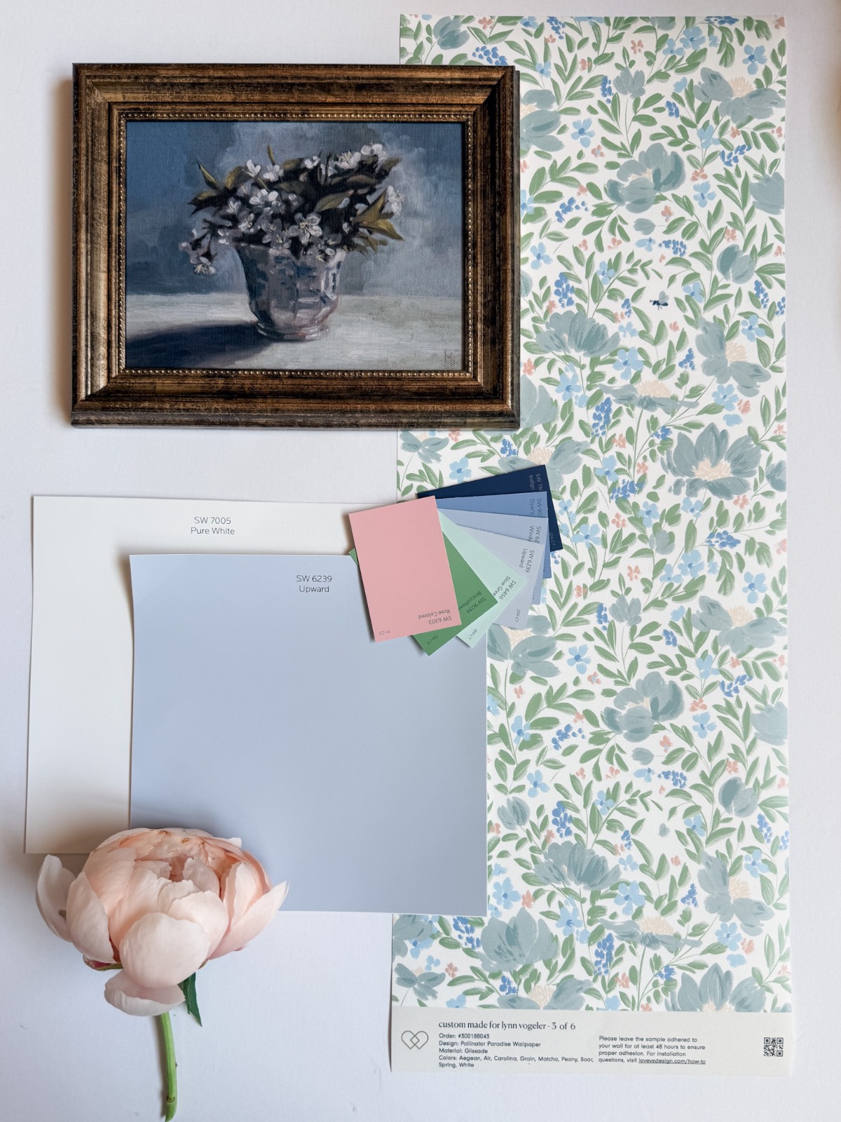
Not only can you select your finish with Love vs. Design, but you can also choose your colors!! How awesome is that? Before making my final selection, they sent me 6 samples to hang in my space and live with. It definitely helped me to decide on the perfect pattern.
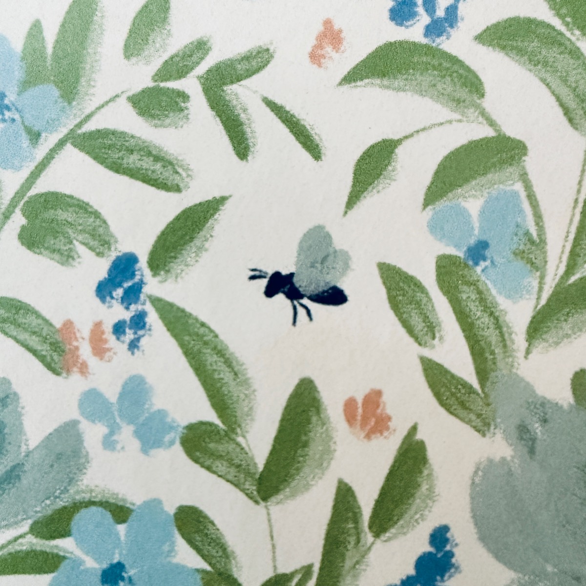
The paper I picked, “Pollinators Paradise,” was my favorite. I selected a white background covered in florals in shades of blues, greens, and a hint of soft peach. The tiny whimsical bee scattered throughout the pattern is one of my favorite features.
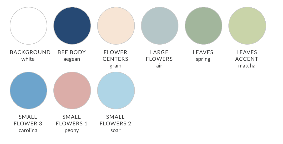
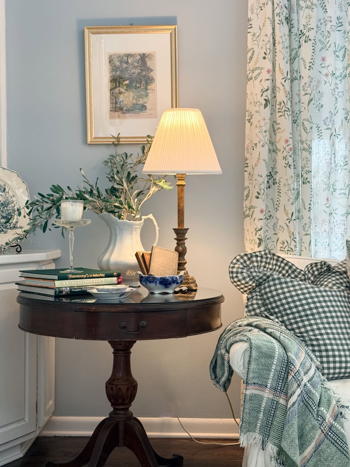
The colors work beautifully alongside our walls, which are painted in Sherwin-Williams Color of the Year 2024 (SW6239 Upward). Upward is a soft, airy blue, and the overall palette feels cohesive with this color that covers the walls in our kitchen, living room, and dining room.
The Door: Going One Shade Darker
Before the paper went up, the door got a refresh. It was originally black, and I painted it one shade darker than my SW6239 Upward walls. I chose to use the Clark and Kensington brand of paint on the advice of my friend Amy Sadler, who is a painting professional. I had my local Ace Hardware, which carries this brand, color match it to SW6240 Windy Blue.
Instead of a stark black door, it became a soft, muted blue that is just a touch deeper than the walls. It’s a subtle shift, but it completely changes the feel of the space.
Going from black to a soft blue-adjacent shade has lightened up the corner considerably. It sounds like a small thing, but a black door absorbs light and can make an entry feel like a cave. This color, which matches both the new paper and the existing wall color, opened up the whole space. The entry went from dark and forgettable to bright and full of personality.
Pro Tips for painting a door
- Tape off all hardware and any windowpanes
- Tape down plastic drop cloths on the floor.
- Clean the door thoroughly with Krud Kutter to remove any grease, grime, or old residue.
- Lightly sand the surface with a 3M ultra fine sander block to give the primer something to grip.
- Wipe the door down with a damp cloth to remove any sanding residue and let it dry completely.
- Use a 3M Final Stripping Pad to make sure your surface is smooth.
- Again wipe the door down with a damp cloth and let it dry completely.
- Apply the first coat of Zinsser BIN primer and allow to dry 45 minutes.
- Lightly sand the primer surface with the 3M ultra fine sander block again.
- Wipe the door down with a damp cloth to remove the sanding residue and let it dry completely.
- Apply the second coat of Zinsser BIN primer, allow to dry 45 minutes.
- Now it’s time to apply two coats of your color. Allow to dry 45 minutes in between each coat.
- Take off your taping and do touch-ups with a small water color paint brush.
If you take the time to prep your surfaces properly, you won’t have issues with peeling or bubbling paint. You will have a nice professional finish. I’m so happy with the way it turned out.
Glissade vs. Peel-and-Stick: My Honest Opinion
In the previous projects I did with Love vs. Design, I used their peel-and-stick paper. It was a perfect paper for Emma’s apartment, as it isn’t permanent, and I found it fairly easy to work with and forgiving.
When I helped a girlfriend paper her daughter’s room with Love vs. Design paper in the Glissade finish, I was hooked. I honestly have to say, it is much easier to work with than any wallpaper I’ve ever used.
I did this wallpaper project mostly by myself, in one day. The Glissade goes up smoothly, repositions without drama, and the finish looks incredibly polished once it’s on the wall. The process feels more professional, and the results look it.
If you’ve been hesitant to try traditional wallpaper because it sounds intimidating, I’d encourage you to give Glissade a shot. The technique of spraying the walls and the paper with water is straightforward, and the payoff is beautiful.
Products I Used for This Project

The Reveal: A Space That Finally Has an Identity
When I walk by the entryway, I can’t help but smile. It’s amazing what a bit of wallpaper and a freshened-up door can do to transform a space. This corner that was dark and uninviting now has such personality.
The floral wallpaper wrapping above the coat wall, around the door, and on the wall to the stairs corner defines the space in a way that no furniture or rug could. The bees, those tiny, whimsical little details in the pattern, are so fun for our grandson, Harrison, as he loves to find them. They are the kind of detail that makes a home feel curated and personal instead of just decorated.
The kitchen is still right there when you walk in, but now there’s a moment, a visual pause, between the front door and the rest of the house. It’s everything I wanted it to be.

Become a Friend of Living Large
Be the first to see affordable decorating ideas, gardening tips and tricks, along with great organizing, entertaining ideas and easy recipes
Final Thoughts
This project has moved into one of my top favorites! Every time I walk by, I smile. With a bit of elbow grease, a can of paint, and a few rolls of wallpaper, it made such a huge impact. I still need to put some things on the walls. Whether it will be artwork, a mirror, or something else, I’m not sure. I want to take my time and get it right.
If you have questions about this project, please ask them in the comments below, and I will answer them for you.
Peace and Love,

Shop & Links
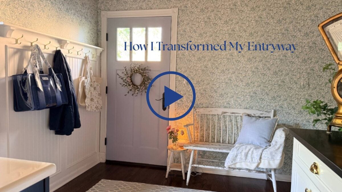
You can explore all of Love vs. Design’s patterns and their custom color tool on their website. They also gave me a 15% off code just for you. Use LVE15F at checkout. You can find the link to the specific design I used below. Make sure you watch the full YouTube walkthrough of the project, from prepping the door to hanging the paper.
This collaboration was gifted by @LovevsDesign in exchange for honest content. All opinions are entirely my own, and this one happens to be extremely favorable.


FAQ’s
Can you really define a space with wallpaper if it doesn’t have its own walls?
Yes, and honestly it works better than you might expect. You don’t need four walls to create a sense of space. Papering one continuous run, even if it wraps a corner, is enough for the eye to read it as a defined area. The pattern does the heavy lifting. Our entryway flows right into the kitchen with no physical boundary between them, and the wallpaper alone gave it its own identity.
Can you paint a dark door to lighten up your space?
Absolutely. In my case, the door being black made the whole corner feel dark and heavy. With the proper prep work, you can paint any door and make your space feel lighter and brighter.
Where can I use bold wallpaper?
Transition spaces are a perfect place to take a design risk. Hallways, entries, and stairwells are great spaces to add some bold paper. I’m also a big fan of dramatic wallpaper in small powder rooms. Play with pattern in spaces that you don’t spend hours in. These are great areas where you can make a statement.

A great way to save this idea is to add it to one of your Pinterest boards. You can find the pin button on the top left of the photo when you click on it. Also, don’t forget to follow me on Pinterest



Meet Me
My name is Lynn. I live in the suburbs of Chicago in a 1,300 sq. ft. home with my Handy husband, Keith.
I’m an open book about my life on my blog. You can find out more about me by visiting my “About Me” page.