Dark and Moody Interior Design: An Interior Designer’s Guide to Creating a Dramatic, Cozy Home
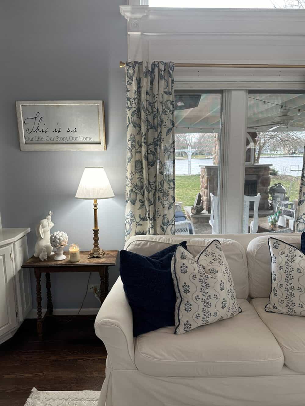
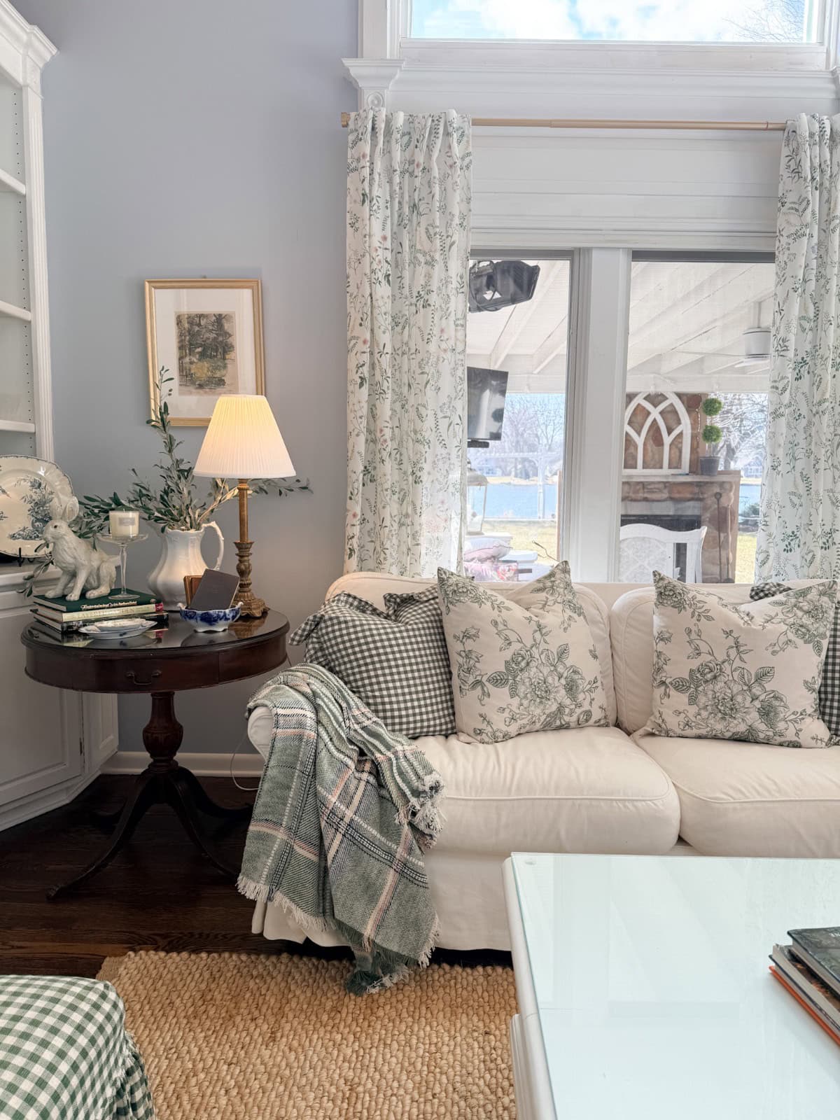
My own home is bright and has a cottage feel. We live on water, where Nancy Meyer’s décor and breezy palette feel completely natural. But, if I could have a second home? It would be dark, moody, and gloriously dramatic: wainscoted walls painted deep navy or hunter green, rich wallpaper, and full color drenching for that cocooning effect I love so much about dark and moody interior design.
With years of experience making a small house feel intentional and layered, I know firsthand that dark and moody interiors aren’t about making a space feel gloomy—they’re about making it feel alive.
My favorite days are when it’s dreary outside and every corner of my home is glowing warmly from perfectly placed accent lamps. I curl up with a cozy blanket and take in how every texture seems to draw my attention to the home I’ve created.
In this guide, I’m going to share everything you need to know to pull off the dark and moody look confidently. Whether you’re going all-in with dark walls throughout your home or just dipping your toes in with a single dramatic room.
On my blog Living Large in A Small House, I may sometimes use affiliate links, which means a small commission is earned if you purchase via the link. The price will be the same whether you use the affiliate link or go directly to the vendor’s website using a non-affiliate link. You can find my full Disclosure Policy HERE
What is the Dark and Moody Aesthetic and Why is it so Appealing?
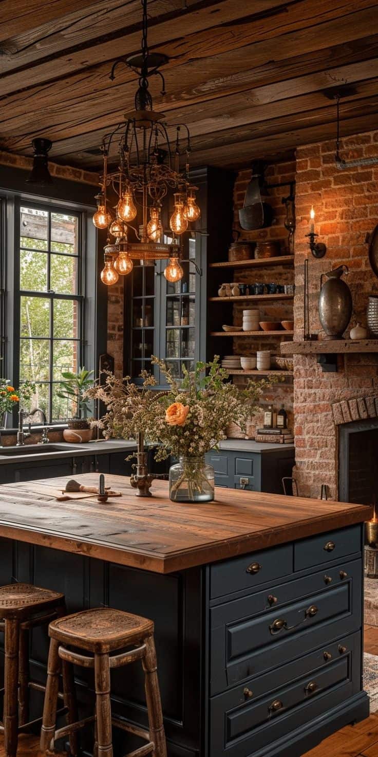
The moody interior trend draws inspiration from old-world European interiors and Gothic architecture. Think Ralph Lauren colors, wood paneling, timeless, and luxurious design.
Today’s dark and moody spaces can be sleek and contemporary, warmly maximalist, or quietly sophisticated. The unifying thread is a sense of depth, deep hues, layered textures, and carefully considered lighting that makes a room feel intentional and intimate.
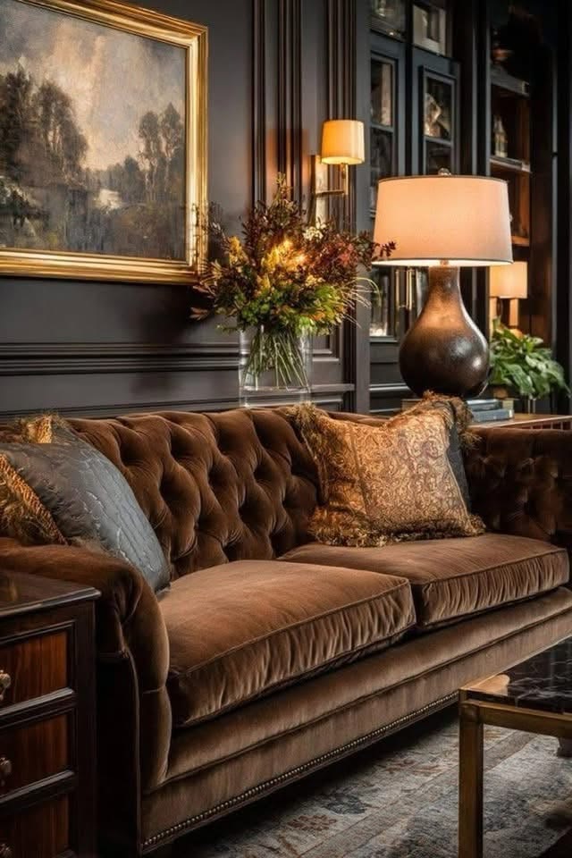
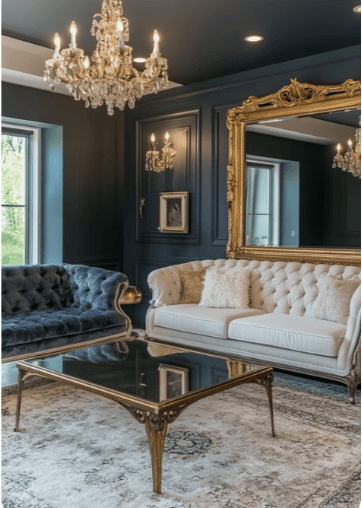
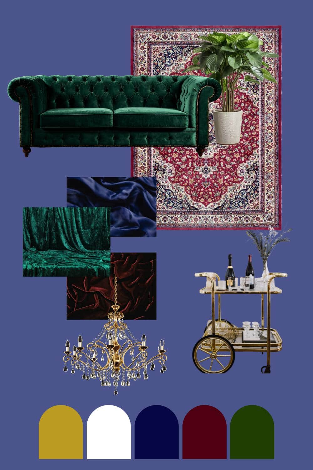
I, personally, am drawn to the old-world version of this style. A rich single color was carried across the walls and trim, using varying tones and finishes. Layer that with deep jewel toned furnishings for a punch of color. I’m picturing navy-blue walls, ceiling, and trim with a maroon velvet sofa! It’s a look that is rich and regal.
One thing I love to remind readers is that you don’t need dark walls to get a moody feel. I’ve seen homes in Northern Sweden and the English countryside with light, creamy interiors that feel deeply atmospheric simply because of the climate. Some areas of the world have perpetually overcast skies, where candles burning all day is the norm. Adding textures like wool and linen layered everywhere makes a space feel even more cozy. Moodiness is about intention, not just pigment.
How to Choose the Right Dark Paint Colors for Your Space
Color is the foundation of a dark and moody interior. When you get this right everything else falls into place. Here’s how to think about it like a designer.
Understanding Paint Undertones
Undertones are the subtle secondary hues hiding within a paint color that only reveal themselves once they’re on your walls. A color labeled “charcoal” might pull distinctly blue, green, or even purple depending on your lighting and surroundings, and that undertone is what determines how your finished room feels.
Blue and green undertones tend to read as calm and sophisticated, making them a natural choice if you want your space to feel like a quiet retreat. Red and purple undertones bring warmth and drama, leaning more theatrical and enveloping. Brown and gray undertones feel grounded and earthy, more understated than moody.
This is why two paint chips that look nearly identical on a sample card can create completely different atmospheres once they’re living in your space.
Before you fall in love with a color name, figure out what it’s secretly pulling towards because that undertone is doing more emotional work in your home than the color itself.

Consider Your Light—This Is Critical
As an interior designer, one of the most common mistakes I see is choosing paint colors without accounting for the room’s light. A north-facing room with cool, indirect light can make the same dark paint colors feel flat and heavy, while a south-facing room with warm afternoon sun will make that same color glow.
I always encouraged my clients to test large paint swatches of paint on several walls and observe them at different times of day before committing.
If your room is on the darker side, you can still achieve a moody feel—it’s about using warm-toned darks and layering light sources rather than relying on natural light to do the work.
Play with Finishes
One of my favorite designer tricks for adding depth to a dark room is varying the finish within the same color. Painting your walls in a matte or eggshell finish and your trim in a semi-gloss or even high-gloss in the same hue creates a subtle but sophisticated contrast that you feel more than you consciously notice.
The trim quietly catches the light while the walls absorb it, and the result is a room that feels layered and intentional without any visual competition between colors. In a dark, moody space this approach is particularly powerful. The sheen on a glossy trim almost glows against a flat, matte wall, adding that sense of depth and richness that makes a room feel well thought out rather than just painted dark.
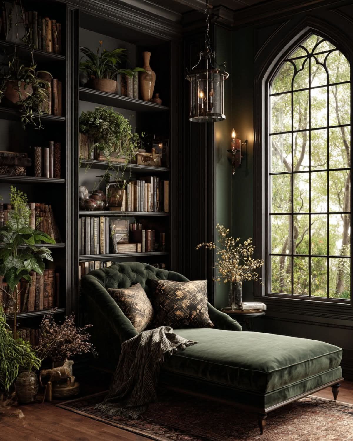
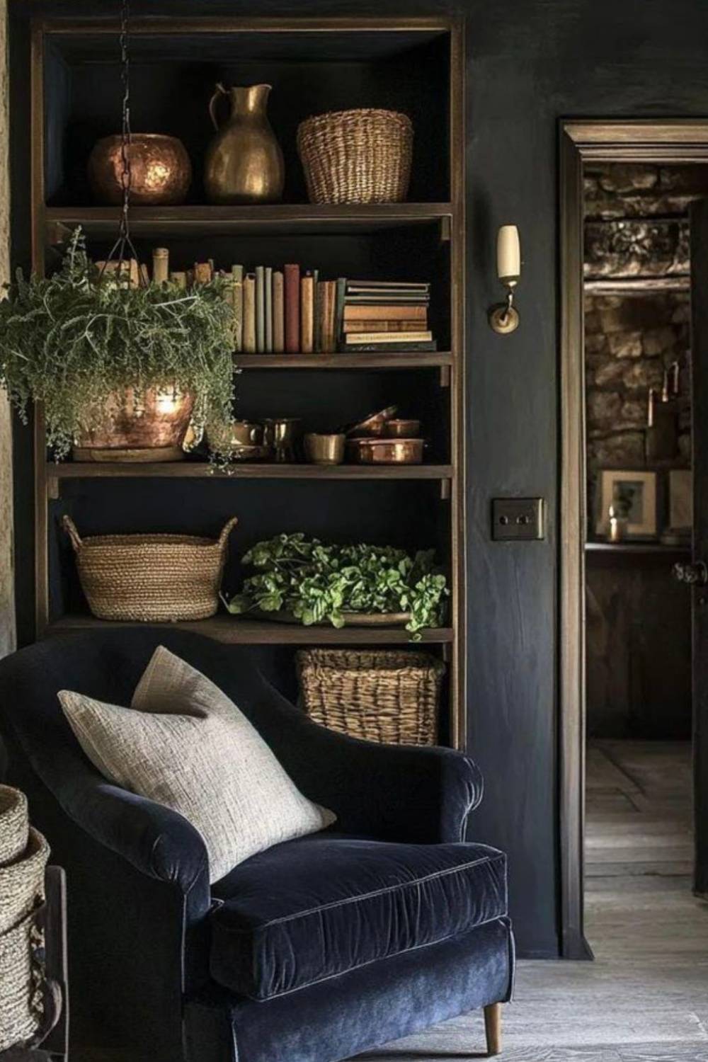
The Role of Texture and Pattern in a Moody Interior
In a dark room, texture becomes your best tool. Without the variation that light walls naturally provide, you need surfaces that catch and interact with light differently. This is where your space goes from flat to rich.
Layering Textures for Visual Warmth
Think in contrasts: a sleek leather sofa against a plush wool rug. A linen throw over a velvet cushion. A matte-painted wall behind a glossy tile or lacquered cabinet. These contrasts are what make a dark room feel alive rather than oppressive.
Sticking to a tight monochromatic palette while varying texture is a particularly powerful approach in small spaces, and it reads as sophisticated and complex without becoming visually chaotic.
Using Pattern Strategically
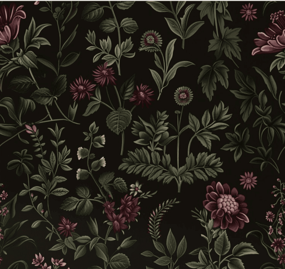
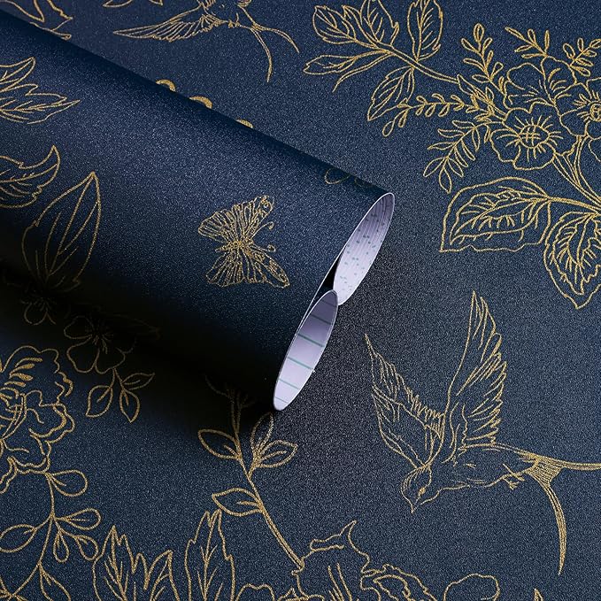
When it comes to pattern in a dark and moody space, scale is everything, and the rules might surprise you. A large-scale pattern in a small room, like a bold dark floral wallpaper in a powder room or small bathroom, is often far more dramatic and successful than the same paper in a large space where the repeat gets lost. The smallness of the room actually contains and amplifies the pattern, turning it into something genuinely a showstopper.
On the flip side, a smaller-scale wallpaper used throughout a larger room gives you much more flexibility with your furnishings. The paper acts almost as a textured neutral, which means you can bring in a large-scale pattern on an upholstered sofa or a dramatic area rug without the two competing for attention. The mistake most people make is defaulting to small patterns in small spaces and large patterns in large ones. However, in a dark and moody interior, leaning into the unexpected is almost always the more interesting choice.
Lighting a Dark Room: How to Create Atmosphere Without Losing Functionality
This is where I see the most design errors in dark interiors and where getting it right makes the most significant difference. Lighting in a moody space should never come from a single source. The goal is layers.
Build a Layered Lighting Scheme
Combining different light sources is crucial for well-balanced light in any space. Layer task lighting (table lamps, floor lamps) with accent light (wall sconces, candles, picture lights, and even up-lighting). If the room’s function and design lend themselves to overhead ambient light (a pendant or chandelier), always have it on a dimmer.
The ability to turn off the overhead lighting and rely solely on lamps completely transforms the feel of a room. This is the moody evening mode that dark interiors are built for.
Don’t Underestimate Your Light Bulbs
I have replaced all the cool-white bulbs in my lamps with warm, amber-toned bulbs, and it immediately transformed the feel of my space in a way I can only describe as glowing. For a dark, moody room, it is even more crucial to always use warm-toned bulbs (2700K–3000K). The difference is dramatic and costs almost nothing.
Use Reflective Surfaces to Bounce Light
Mirrors, metallic accents, glass décor, and glossy finishes all help circulate light around a darker room. Positioning a large mirror opposite a window maximizes whatever natural light you do have. Gold and brass fixtures have a warmth that feels particularly at home in a moody space.
Creating Focal Points That Anchor the Room
In a dark room, the eye needs somewhere to land. Strong focal points are what prevent a moody space from feeling undirected or heavy.
Accent Walls with Architectural Detail
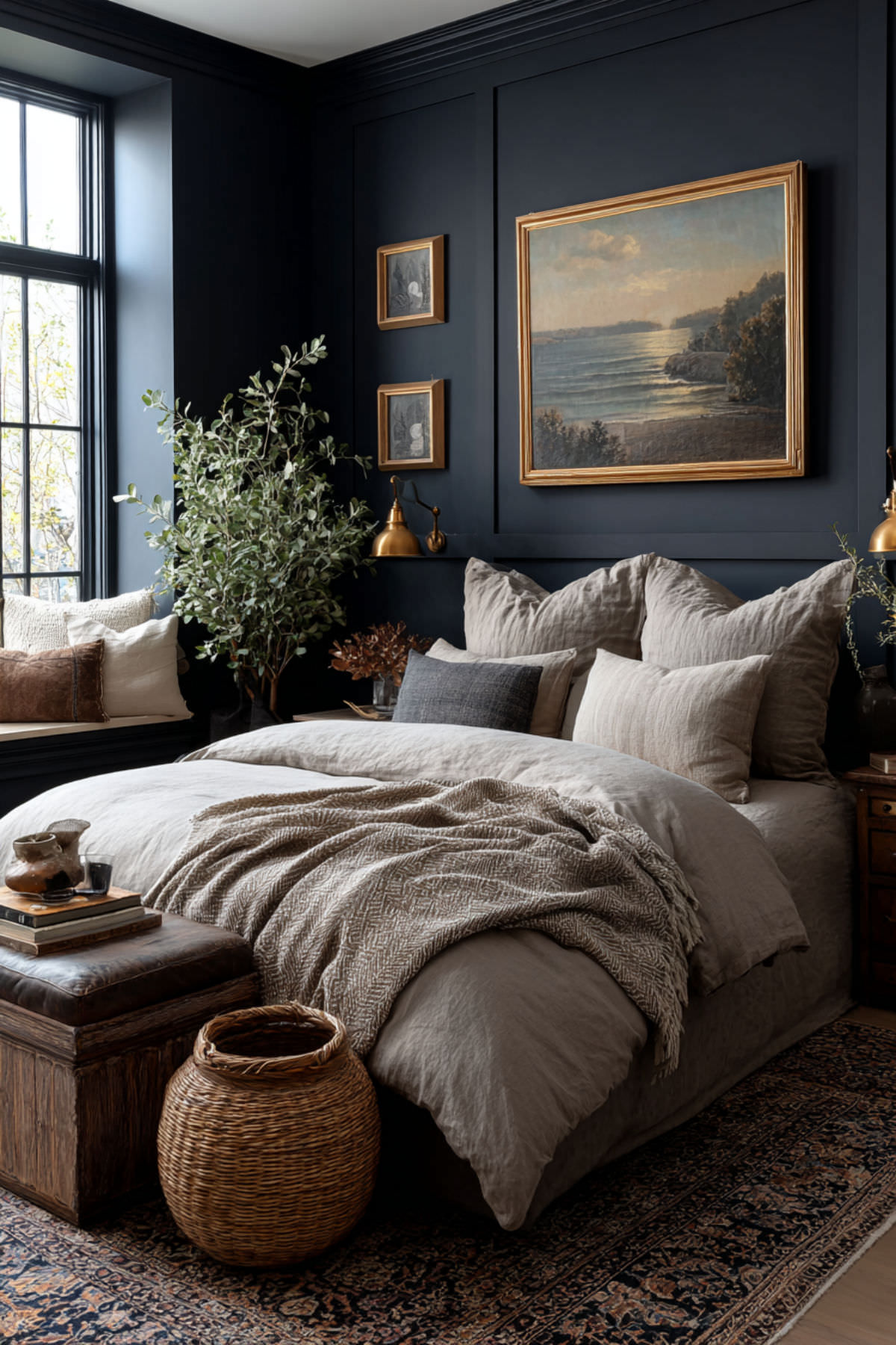
One of my favorite ways to create a focal point in a moody room is wall molding, paneling, or wainscoting painted in a rich, saturated hue. The dimension created by molding adds a level of shadow and depth that flat paint alone simply cannot achieve. It reads as layered and thoughtfully considered, not just “a dark wall.”
Statement Pieces and Art
Oversized artwork, an interesting light fixture, or a piece of sculptural furniture can serve as a focal anchor. Artwork that mimics the look of oil paintings, even affordable prints, add that old-world richness that pairs beautifully with dark palettes. The goal is one strong hero piece, not several competing for attention.
Would you like to save this?
Dark and Moody in Small Spaces: Yes, You Can Do It
As someone who has spent years perfecting the art of making a small house feel beautiful, I want to reassure you: dark colors in a small room are not automatically a mistake. The conventional wisdom that small rooms need light colors is far too simplistic.
In fact, painting a small room a single deep color—walls, trim, and ceiling—creates a cocooning effect that can make a space feel intimate and intentional rather than cramped. The trick is not to fight the smallness but to lean into it.
In small spaces specifically, I recommend fewer, larger furniture pieces rather than many small ones; furniture with legs (which creates visual breathing room at the floor); hidden storage to keep surfaces clear; and curtains hung at ceiling height to draw the eye upward.
Room-by-Room: Implementing the Dark and Moody Look
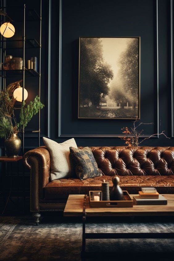
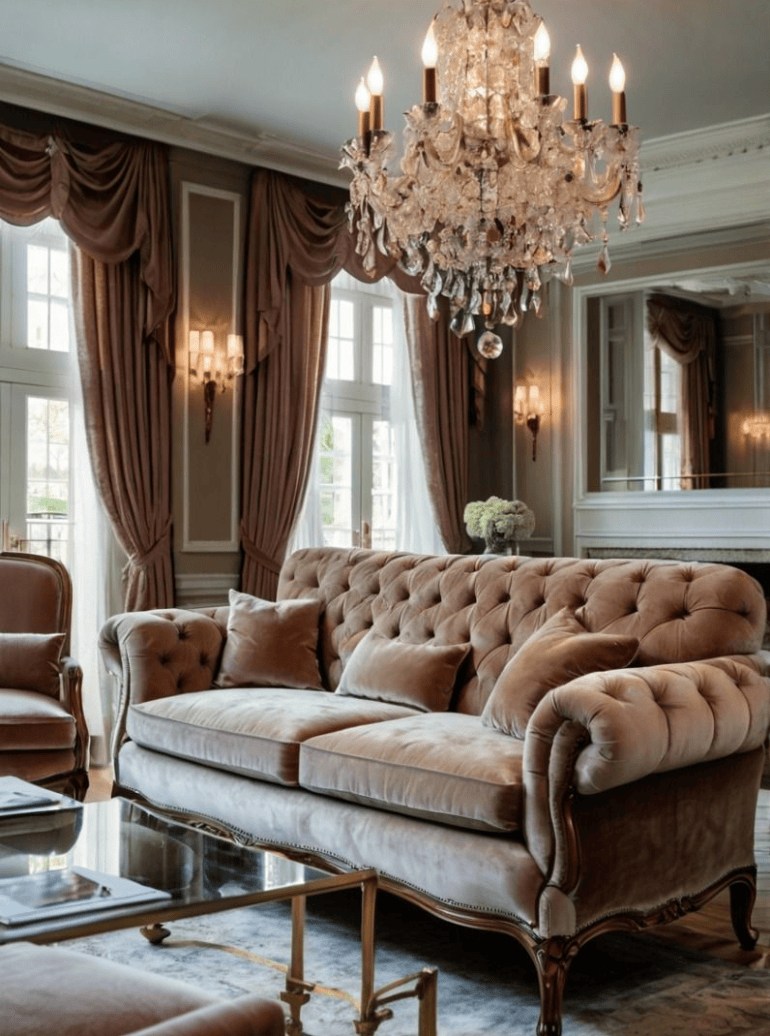
Moody Living Room
The living room is where this aesthetic really sings. A deep velvet sofa, dark curtains hung ceiling to floor, layered rugs, and warm lamplight can make even a modest-sized room feel like a jewel box. Balance the dark elements with lighter accents—a natural wood coffee table, a stone or ceramic lamp base—to keep the room from feeling closed off. Consider swapping sheer curtains for a more dramatic floral, textured linen, or velvet panel. I recently made this change in my own great room and was surprised by the transformation.
Dining Room
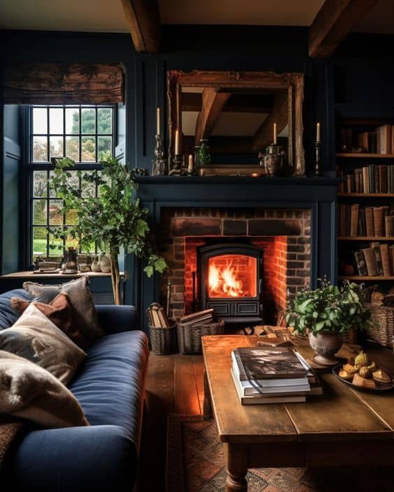
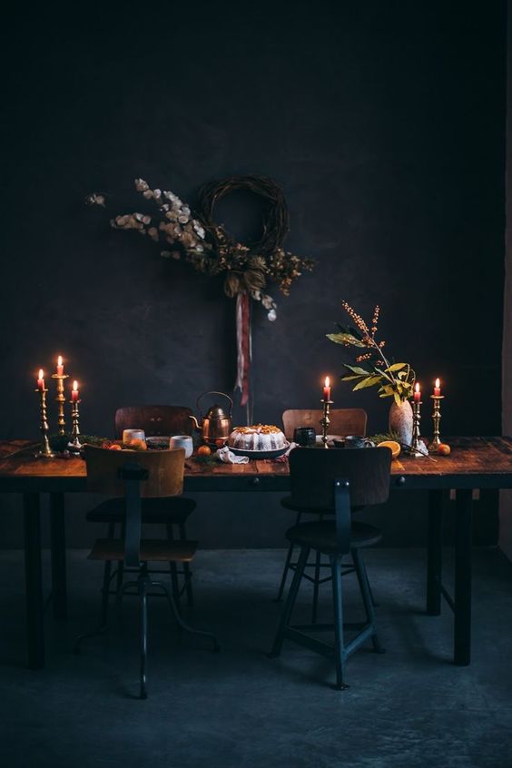
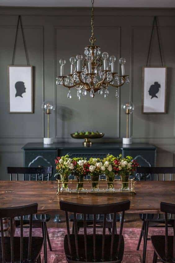
The dining room is arguably the single best room in the house for a dark and moody treatment. It’s used primarily in the evenings when lighting is controlled, and the intimacy that dark walls create is precisely what you want at a dinner table. Deep green or navy walls, a statement chandelier, and a dark wood table make for an unforgettable space.

Home Office
Darker walls in a home office can actually support focus and productivity by reducing visual distraction. Pair dark walls with a warm desk lamp, natural materials like wood and leather, and a few plants to keep the space from feeling oppressive. Light-colored artwork or a gallery wall provides visual relief.

Powder Room—The Secret Weapon
The powder room is the single best place to take a design risk in your home. Because it’s small and guests are there only briefly, you can go bolder here than anywhere else. A floor-to-ceiling dark wallpaper in a dramatic print, a dark vanity, and a statement lighting fixture can create a genuinely memorable moment.
My powder room is currently white and bright, but I’m actively planning a dark wallpaper transformation because I know exactly what it could be.
Finishing Touches: Accessories and Natural Elements
Accessories in a dark and moody space should feel collected and well thought out not matched or overly coordinated. A few principles that guide me:
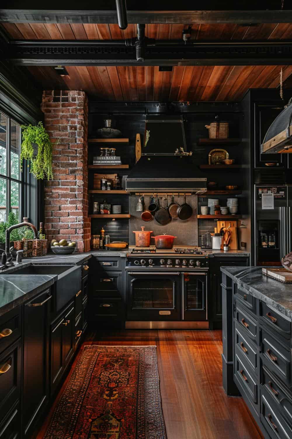
- Lean into natural materials: leather, wool, linen, dark wood, and stone. These add warmth and organic variation that synthetic materials can’t replicate.
- Add plants. Green against dark walls is one of the most beautiful pairings in interior design. Even a single large-leafed plant in a corner adds life.
- Don’t overlook candles. Beyond actual candlelight (which is irreplaceable in my opinion), the vessels themselves—whether ceramic, glass, dark wood, or metal—add beautiful detail at eye level on a surface.
- Warm metallic accents in brass, bronze, or aged gold feel more at home in a moody space than cooler silvers or chromes.

Final Thoughts: You Don’t Have to Go All In
Dark and moody design is a spectrum. You don’t have to paint every room navy blue or commit to a full renovation to get a taste of this aesthetic. Sometimes it’s a single mood wallpapered powder room. Sometimes it’s swapping out your light bulbs and adding a velvet throw. Or sometimes it’s one oversized piece of dark, dramatic artwork on an otherwise light wall.
My home will always lean bright, cozy, and cottage-inspired, but I’m slowly working in moments of drama wherever I can find them. There’s a reason I fantasize about that second home with the hunter green walls and painted ceilings. There’s something deeply satisfying about a space that feels like it’s wrapping around you.
Am I the only one who could own ten homes and have an entirely different design fingerprint in each one?
Become a Friend of Living Large
Be the first to see affordable decorating ideas, gardening tips and tricks, along with great organizing, entertaining ideas and easy recipes
Peace and Love,


A great way to save this idea is to add it to one of your Pinterest boards. You can find the pin button on the top left of the photo when you click on it. Also, don’t forget to follow me on Pinterest


Meet Me
My name is Lynn. I live in the suburbs of Chicago in a 1,300 sq. ft. home with my Handy husband, Keith.
I’m an open book about my life on my blog. You can find out more about me by visiting my “About Me” page.


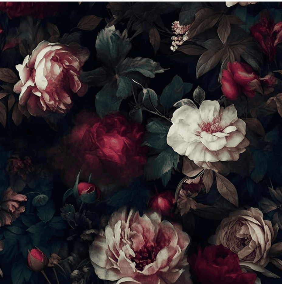
I love the paint color and dark floral wallpaper in the 4th photo. Any idea where I can find those? Thanks
Hi Michael – The photo was from Pinterest and I couldn’t track down the original source. I’ve found some really great dark & moody floral wallpaper on Etsy. I wish I could help you more. I have a link to the paper that I found under the photo.