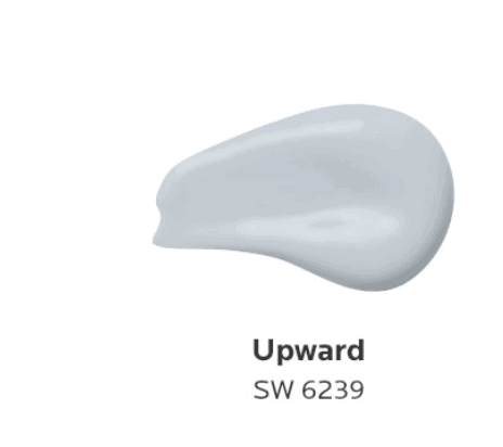
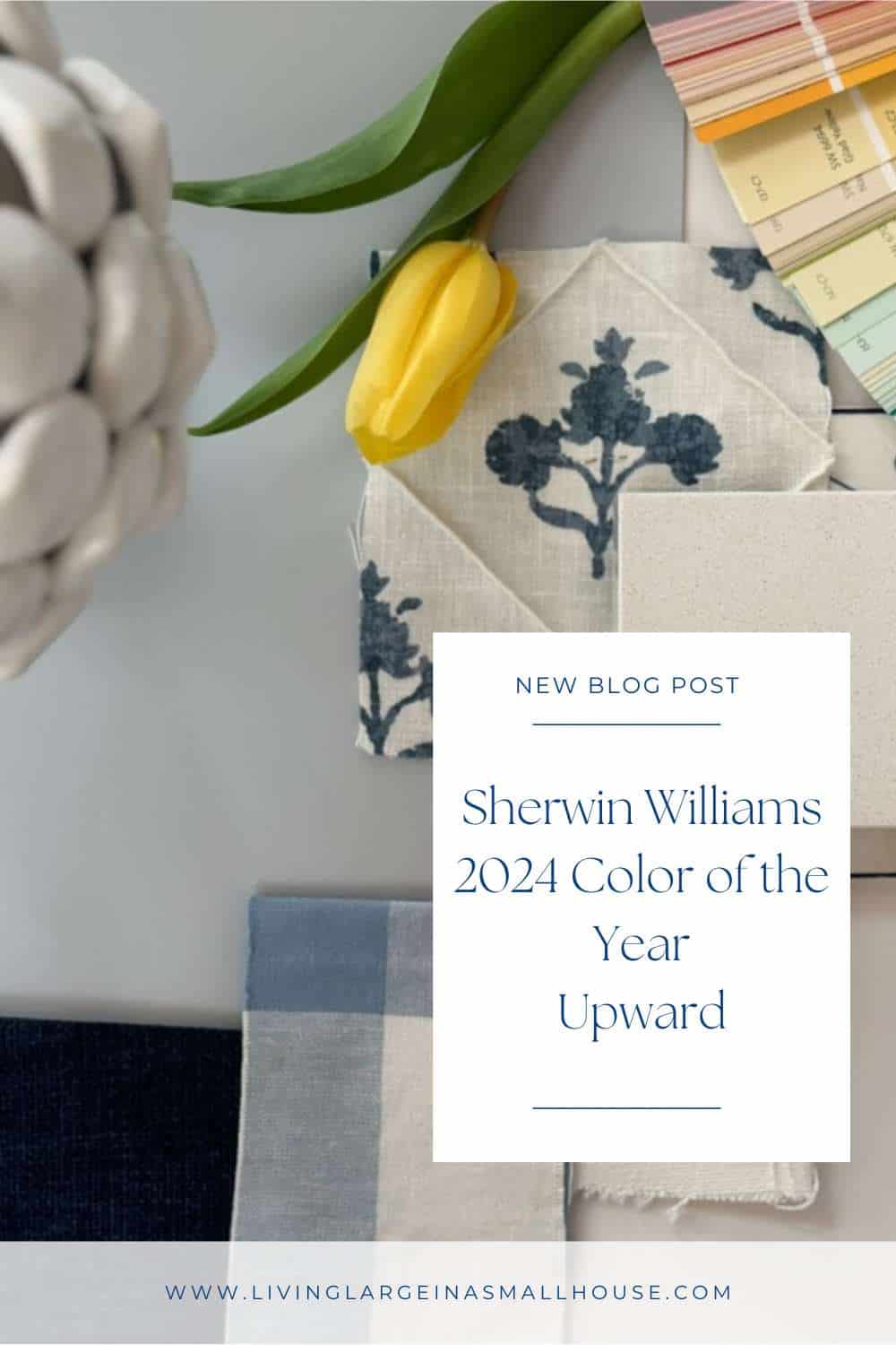
Sherwin Williams 2024 Color of the Year – Upward
In the ever-evolving world of interior design, color plays a pivotal role in setting the tone for our living spaces. As we step into the promising realms of 2024, Sherwin Williams unveiled its much-anticipated Color of the Year – Upward SW6239.
This enchanting shade, carefully curated by Sue Wadden, the Director of Color Marketing at Sherwin Williams, promises a gentle forward momentum, infusing our homes with a new sense of ease and sunny day energy.
On my blog Living Large in A Small House, I may sometimes use affiliate links, which means a small commission is earned if you purchase via the link. The price will be the same whether you use the affiliate link or go directly to the vendor’s website using a non-affiliate link. You can find my full Disclosure Policy HERE
Upward SW: A Notion of Contentment
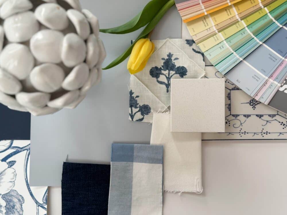
In a press release, Sherwin Williams describes Upward SW as a color that embodies a notion of contentment. As we bid farewell to the earthy tones that dominated last year, Upward SW emerges as the beautiful color that effortlessly balances the past and the future. This light blue hue, part of the renewed Comfort Color Collection, introduces subtle nuances that resonate with a sense of calm and renewal.
Using Upward in My Home
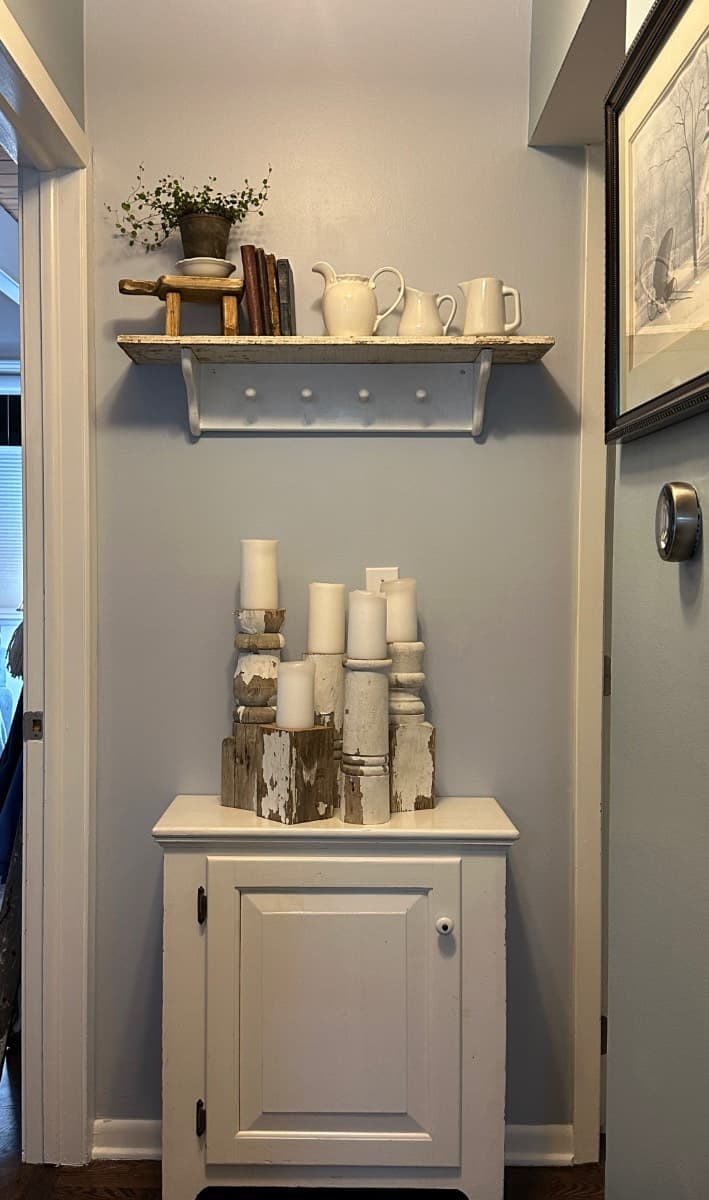
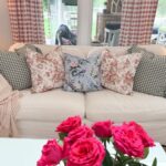
I am leaping into the new year by updating my great room (living room, dining room, kitchen, and hallways) with this paint color. While “Handy” doesn’t think it’s much different than what we already have, as an Interior Designer I was drawn to it because of its cool tones. It’s completely different in my opinion.
Besides the fact that I love this new color and was immediately drawn to it when I saw it, our space is in desperate need of fresh paint.
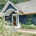
Another thing that struck me was that the color “Indigo Batik” which is in the same color family is what we chose for our home’s exterior color as well as the cabinet color in our recently remodeled laundry room.


Sue Wadden and the Sherwin-Williams Design Team
Behind the scenes, Sue Wadden and the Sherwin-Williams design team meticulously selected Upward SW6239 to be the focal point of the 2024 color palette. Wadden, a key figure in the paint company, is known for her keen sense of global color trends.
This year, she envisions a palette that invites a lightweight open-mindedness into our living spaces, combining warm neutrals with the magnetic allure of cool blues.
Versatility in Design
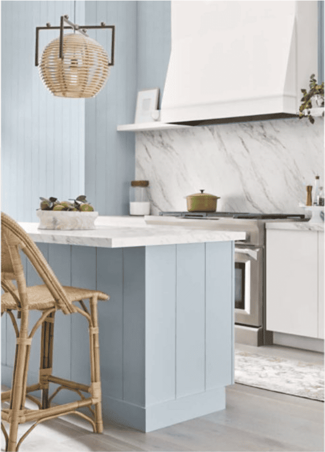
Upward SW is not just a color; it’s a versatile canvas waiting to be explored. From kitchen cabinets to accent walls, this shade seamlessly integrates into a variety of design elements.
The Sherwin-Williams team suggests pairing Upward SW with warm whites like Snowbound SW7004 or the deep richness of Tricorn Black SW6258 for a timeless and sophisticated look. The color collection of the year extends beyond the walls, embracing spaces like dining rooms, laundry rooms, and even front doors.
Things I’m Loving Right Now

The Sherwin-Williams Colormix Forecast
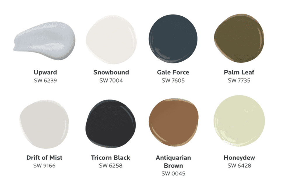
As part of the Colormix Forecast, Upward SW joins an array of hues like Gale Force SW7605, Palm Tree SW7735, and Drift of Mist SW9166 to create a palette that captures the essence of the upcoming year. This forecast, a reflection of key trends, is not just a glimpse into the design world but a guide for those seeking to infuse their homes with a sense of balance, comfort, and unique personal style.
Would you like to save this?
Incorporating Upward SW into Your Home
If you like me are aiming for the Grandma coastal vibe meets Nancy Meyers design. A cool blue color like Upward SW6239 seamlessly complements a variety of traditional color combinations.
This beautiful shade can be paired with warm undertones, dark colors, or even the energizing tones of Tangerine. The annual Colormix is a testament to the versatility of Upward SW6239. It’s the perfect choice for homeowners looking to craft interiors that speak to their individuality. I liked it so much I decided to paint my office desk with the left over paint from my walls.
Conclusion
While I am starting 2024 with Sherwin Williams’ Color of the Year, Upward SW6239; and will be maintaining that neutral soft look in my home, I invite you to renew, refresh, and embrace a new approach to color. Take a chance on some of the bolder shades that coordinate with Upward.
From the soothing ethereal calm it brings to our homes to the energizing and uplifting vibe it exudes; Upward SW stands as a testament to the transformative power of color. Let this beautiful shade guide you in creating spaces that resonate with a sense of comfort, balance, and, above all, a touch of personal style.
Peace and Love,
A great way to save this idea is to add it to one of your Pinterest boards. You can find the pin button on the top left of the photo when you click on it. Also, don’t forget to follow me on Pinterest
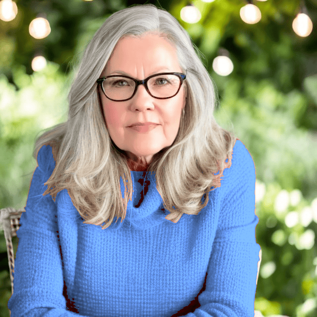
Meet Me
My name is Lynn. I live in the suburbs of Chicago in a 1,300 sq. ft. home with my Handy husband, Keith.
I’m an open book about my life on my blog. You can find out more about me by visiting my “About Me” page.


I love this new color in your living room, Lynn! It is the perfect shade for your home. It seems to have the perfect mix of grey and blue.
It is such a pretty color. It’s cool, calm and clean looking!
What a gorgeous color Lynn! I’m loving it so much. Pinned!
I’m just loving the color too! It makes me smile when I see it everyday. It’s such a calm, cool blue.