How I Refreshed My Home for Summer and Why Cranberry is My Unexpected Color of the Season
If you’ve been here a while, you might know that I do a seasonal swap four times a year. I take down the spring look and bring in something that feels right for summer. Last year I wrote about this transition and showed you how I added pops of yellow to my blue and white. This year is a completely different story.
This summer I went warmer, richer, and honestly a little bolder. I brought cranberry back into my home.
That might not sound like a dramatic statement, but for me it kind of is. I had not used cranberry anywhere in my house in years. Not even at Christmas. Then last December I finally brought it back in for the holidays, and I loved it so much I could not let it go. The remodeling we were doing last winter kept me from publishing that Christmas content, so you haven’t seen much of it yet. It is coming this year, I promise, and it will be worth the wait. But the short version is: cranberry came back into my house in December 2025, and it felt completely right.
So when it came time to think about summer, I kept coming back to that color. Cranberry for summer. I know that sounds unexpected. But stay with me, because it works.
On my blog Living Large in A Small House, I may sometimes use affiliate links, which means a small commission is earned if you purchase via the link. The price will be the same whether you use the affiliate link or go directly to the vendor’s website using a non-affiliate link. You can find my full Disclosure Policy HERE
Why Cranberry for Summer?
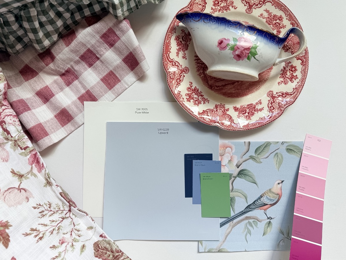
The first thing I want to say is that this is not a girly pink. It is not a valentine red. It is a deep, rich cranberry that reads almost dusty and vintage, and it plays beautifully with the blue and white I already have throughout my home.
What I love about cranberry as a seasonal color is how versatile it is across the whole year. Think about it: It works at Christmas, obviously. It works beautifully in fall alongside warm wood tones and dried botanicals. And it works in summer because it is essentially a berry color, and berries are as summery as it gets.
Cranberry is a Berry. And Berries are Summer
I also think of it as a color that has enough weight to feel intentional without feeling heavy. The light florals and soft greens I had up for spring were beautiful, but they were also very breezy and a little airy. I wanted something with more presence for summer. Cranberry has given me that.
The palette I landed on was cranberry, soft greens, and the blue and white china that I rarely ever put away. Here is how each piece came together.
Where It All Started: A Sofa I Couldn’t Have
Here is the honest origin story of this whole summer refresh. I was scrolling through Liz Marie Galvan’s Instagram, and I saw a cranberry gingham sofa that stopped me in my tracks. It was exactly the kind of piece I didn’t know I needed until I saw it. Warm, pattern-forward, with a ruffled skirt, it was completely cozy and charming.
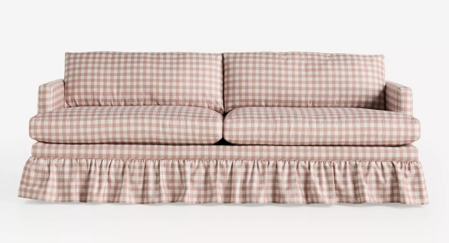
Then I looked up the price tag. And I quickly came to terms with the fact that swapping out furniture with the seasons is not a lifestyle I can entertain.
But the color and the pattern had gotten into my head, and I couldn’t let them go. So I started looking for cranberry gingham anywhere I could find it. That search led me somewhere I did not expect.
From Sofa Envy to the Perfect Find
Months ago, while browsing the internet, I found curtains at Marshalls. Cranberry gingham curtains. I ordered them immediately.
I’m sharing where I found them because they are unfortunately no longer available on the Marshalls site, which is the nature of that kind of find. I have, however, found very similar curtains and linked them below.
This is where this refresh started. One sofa I couldn’t buy sent me down a path that ended with curtains I love and a whole room that feels completely new.
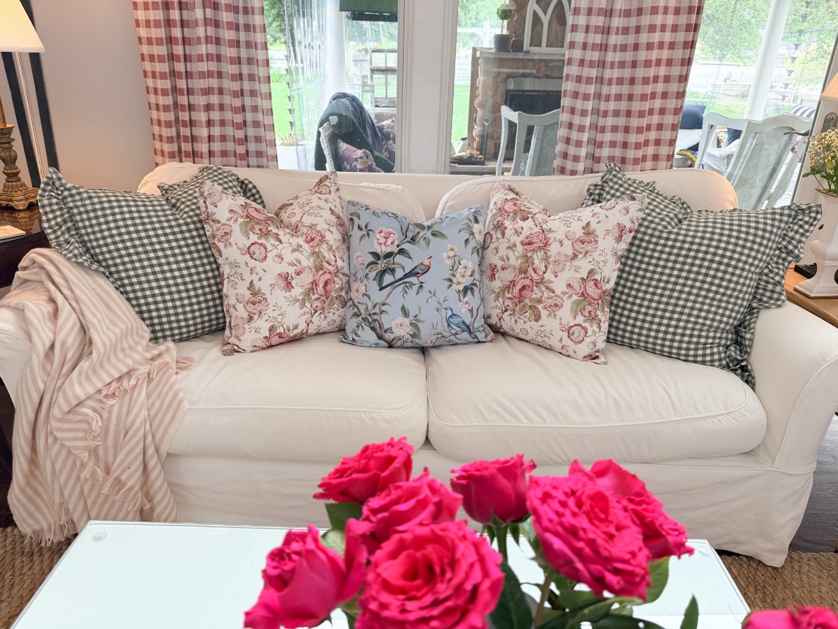
The Pillows: Layering the Pattern
The pillows got a refresh too. I found the most beautiful floral pillow covers with a light cranberry floral print and green foliage. I paired them with the green and white gingham covers I already had out for spring. Keeping the green gingham was an easy decision. It bridges the spring and summer looks and grounds all that floral pattern with something more geometric. The two together are exactly the kind of combination that looks collected rather than matched.
And then I opened a package that arrived after I had put my room together, one that I was not entirely sure about. A chinoiserie pillow cover, birds and florals, in blues, greens, and that same light cranberry. I put it up next to the floral covers and the gingham, and it just works! Who knew something that would go so against the grain of safe design choices would be so unexpectedly lovely? This is what I mean when I talk about designing with what you love, not what’s on trend, in my Small House Decorating Guide.
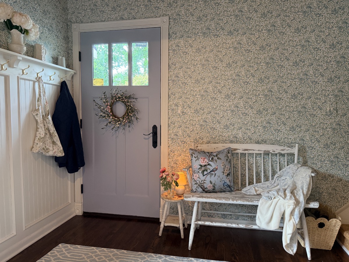
When this design surprise happens and you find a piece that bridges every color story you have going on in one small space, you buy more. I now have them sprinkled around the living area and into the newly wallpapered entryway.
That simple pillow that I wouldn’t have dreamed would work now connects every space without a single room feeling like it is trying too hard to match the next one.
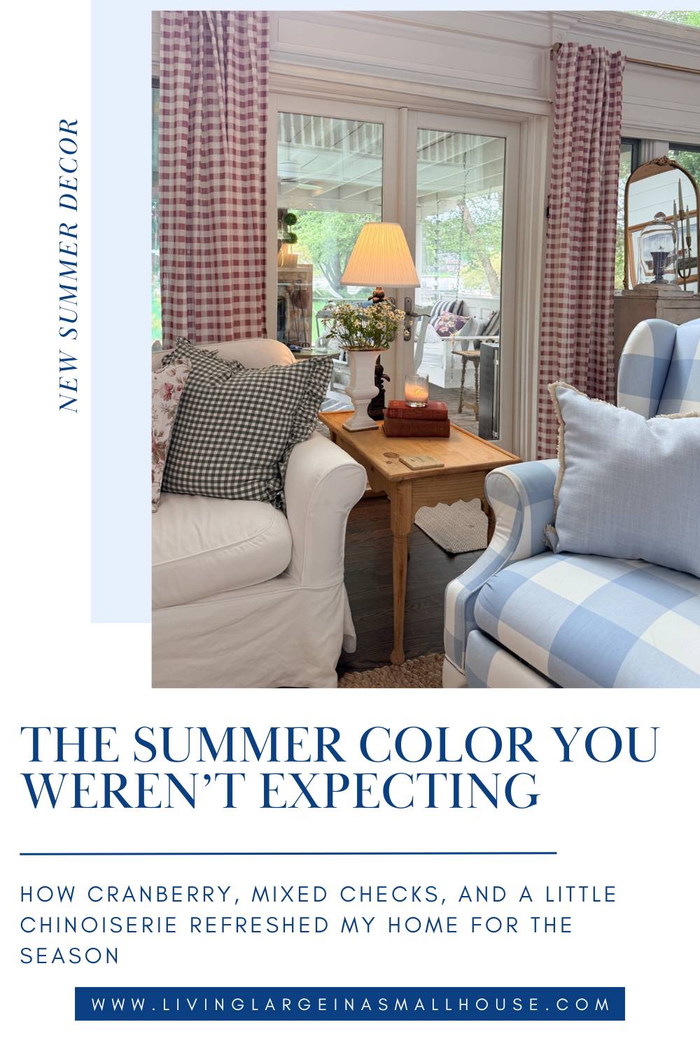
Three Checks, Three Colors, One Room
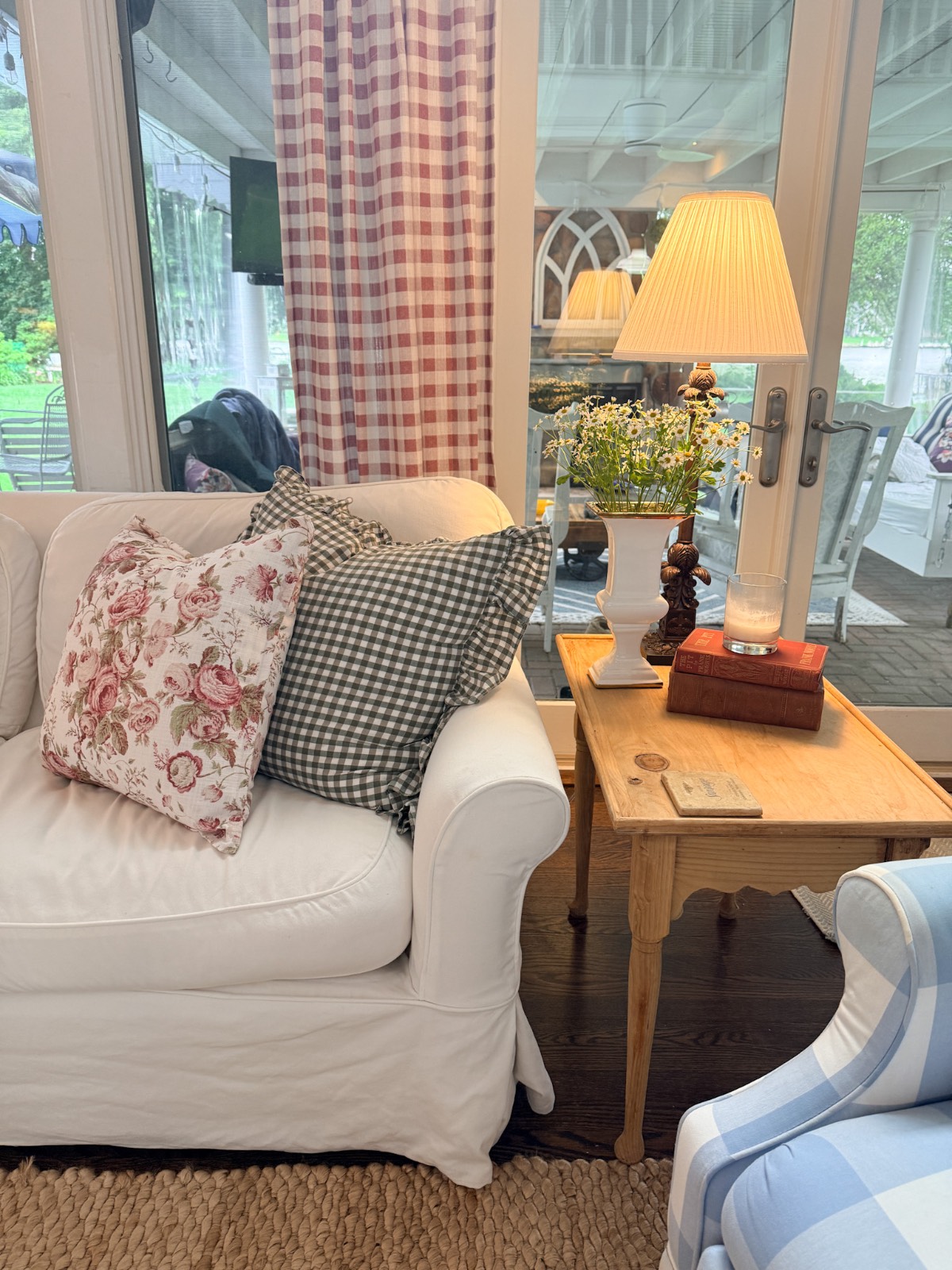
Here is something you would not think would work. I have three different checks in this room right now, and none of them match. Cranberry and white gingham on the curtains, green and white gingham on the pillow covers. And then there is my blue and white buffalo check that has anchored this room through every season.
Three checks. Three different color combinations. Three different scales. You would think the room would look like a picnic tablecloth, but it doesn’t—it looks intentional.
The reason it works is that checks and gingham are part of the same pattern family. They share a geometry and simplicity that makes them natural companions even when the colors are completely different. What ties them together is not the color but the pattern. However, the scale of the print on each one is different, and I believe that is what makes them work well together. They coexist, and the variety is what gives the room a collected, layered quality.
If you have ever been told that your patterns need to match exactly or that mixing checks is risky, I’m here to tell you that is not true. Vary the color, vary the size and scale, and let the pattern family do the rest.
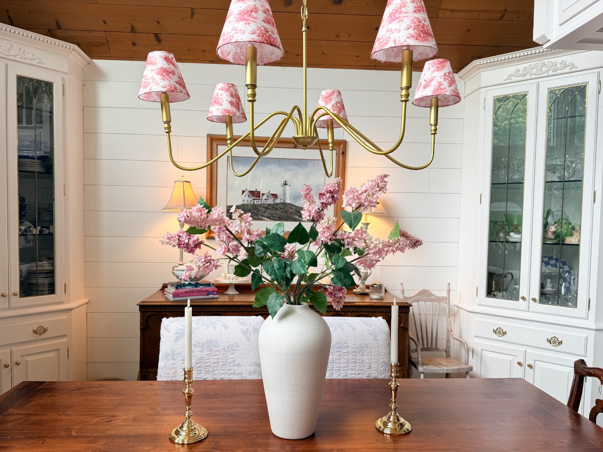
A Note on the Chandelier Shades
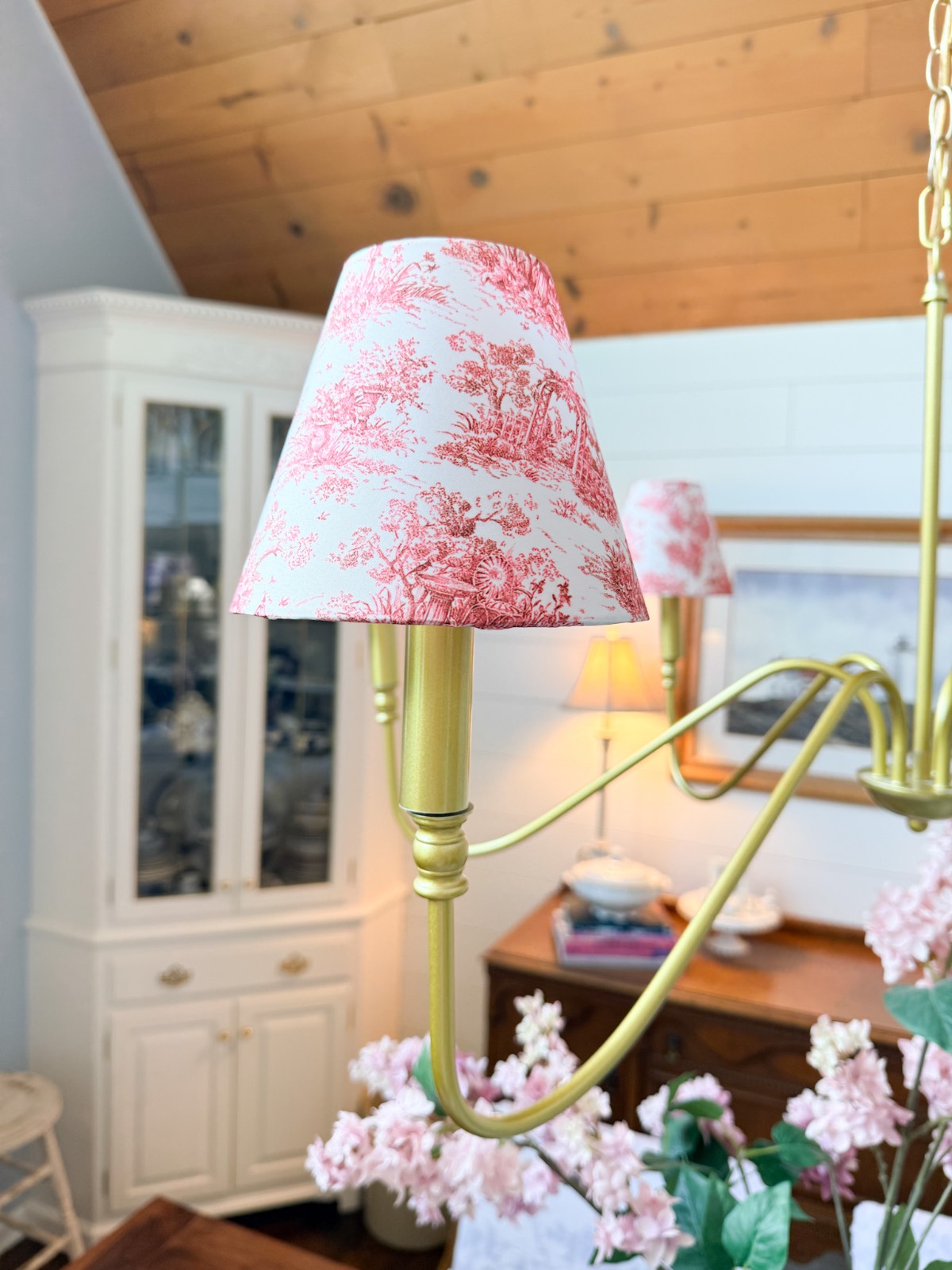
My chandelier has never had shades until this spring when I decided to cover the bulbs with some cute green and white shades. It gives the fixture a softer, more cottagecore feel. So for summer, the shades got swapped out too. I found some charming cranberry and white toile shades. They blend in beautifully with the overall room, which is exactly what a chandelier shade should do. But the curtains are the real story.
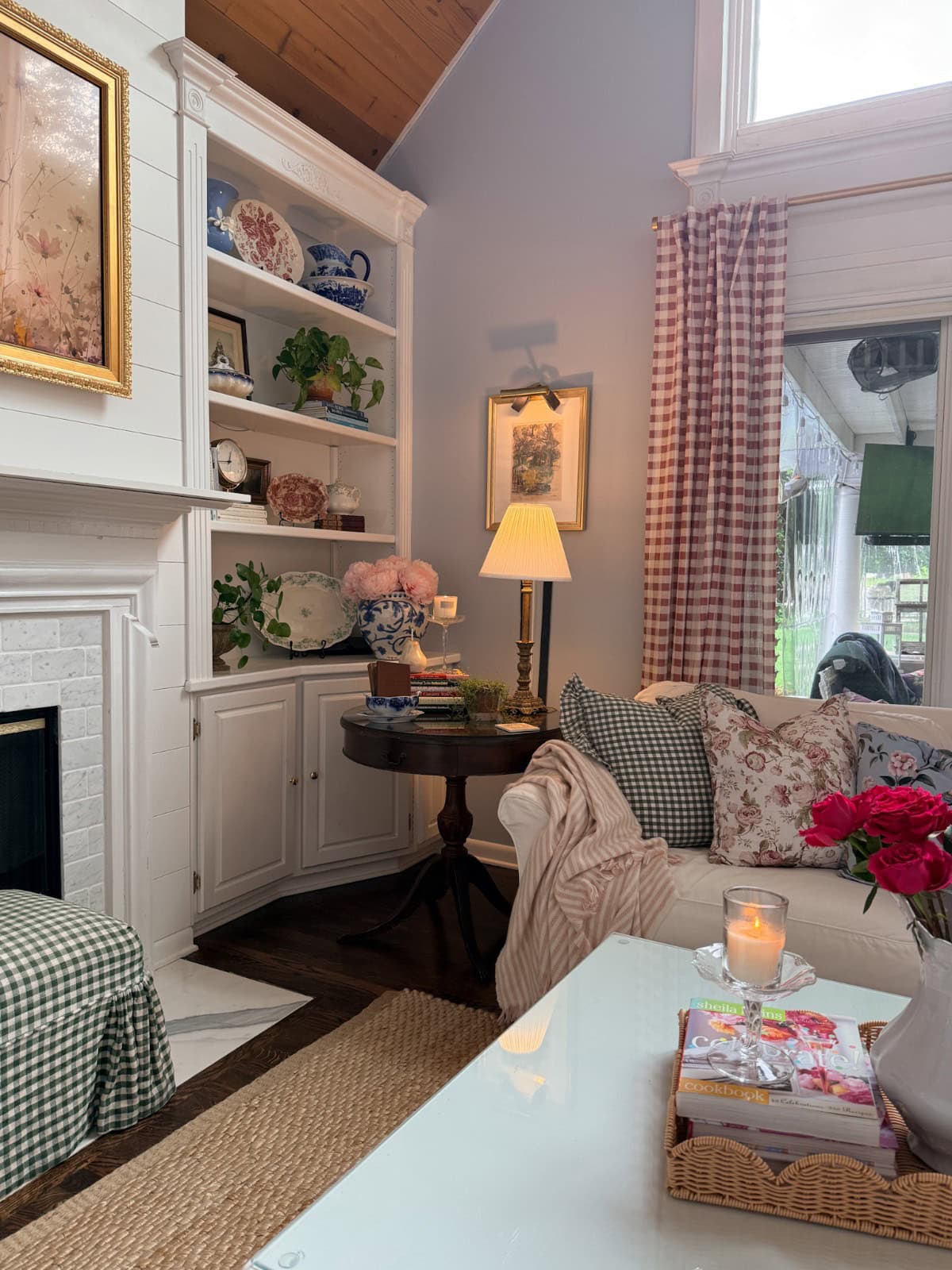
Styling the Shelves: Flow Blue, Transferware, and How to Mix Them
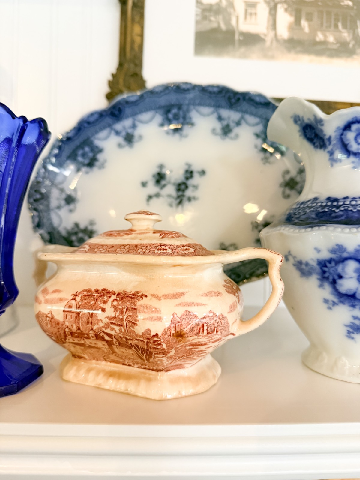
This is the part I get the most questions about: how do you mix collections without it looking like a jumble? Especially when you are working with flow blue china, pink and red transferware, and green transferware all at once.
The answer, at least for me, is that they all share the same cream/white background. That shared element is what makes them read as a collection rather than a pile of old dishes.
Here is how I approach it:
- Flow blue is my foundation. I spread it evenly rather than clustering it, and it sets the rhythm for the shelves.
- Pink and red transferware along with green transferware come in as the accent. A single plate on a stand or a small piece tucked in between two flow blue pieces. It is a sprinkle of moments, not the statement.
- Books with red spines replaced some of the books I had on my shelves and table displays. They add a little more color without adding more pattern.
- While I’m not a great plant mom, living greens add color to a room without competing against patterns. It also adds not only a texture but a natural, bringing the outdoor in element.
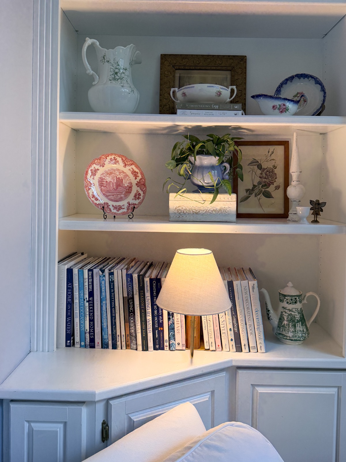
One thing I would add about mixing the reds: do not stress about the transferware and books matching perfectly with the other elements in the room. Mine don’t match at all. The slight variations showcase the collected-over-time look that is not only true to me but also to my home.
Create the Same Look
The Rug Question
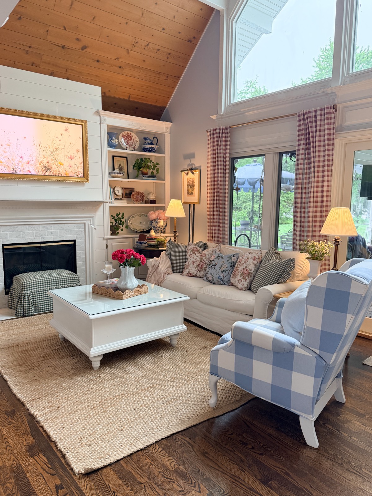
I have a cranberry and navy Persian antique rug in storage that I considered bringing out for summer. I thought about it seriously and decided against it.
Here is my thinking: a sisal rug is genuinely summery on its own. The texture reads natural and casual and warm-weather in a way that a more formal Persian rug does not. It also is so “Nancy Meyers,” which is a look I aspire to. I already have a lot going on in a good way, and adding the old rug on top of all of that would have tipped the room into too much.
My rule of thumb for any decorating decision like this is to make the other small changes first and live with it for a day or two. Let the room tell you what it needs or doesn’t need.
Pulling the Color Through: Strawberry Stems in the Kitchen
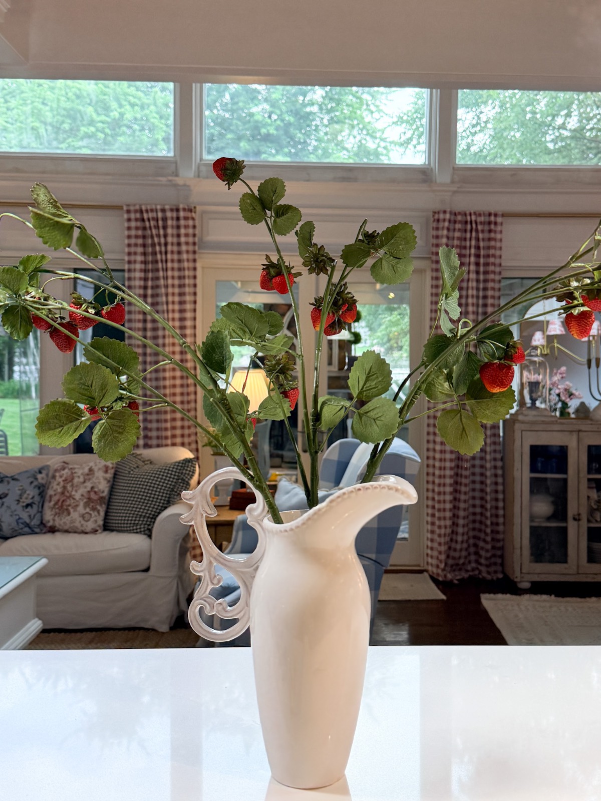
One thing I always try to do when I introduce a new color into the main living space is find a way to pull it into the kitchen as well. The kitchen is connected to everything, and if the color stops in the living space, the whole house can feel disjointed.
For summer I am using faux strawberry stems in a simple vessel on the kitchen island. They bring in just enough of that cranberry-adjacent red to tie the rooms together without making the kitchen feel like it’s trying to match the dining room. Strawberries scream summer. They feel fresh and casual and right for the season.
I’ve also tucked a red ironstone piece into the open shelf wall in the kitchen. That surprise moment!
It is the small things, but small things are usually doing the most important work in a space. Less is more!
Your Questions About Seasonal Refreshing, Answered
Do I have to buy all new things every season?
Not at all. Most of what I swapped are things I already own and rotate in and out. The chandelier shades are interchangeable. The pillows get switched. The shelf accessories come out of the corner cabinets. The curtains rotate not only from season to season but also from room to room. My investment was mostly time.
How do I know when a color is right for a season?
I ask myself whether it feels appropriate to what is happening outside. Summer is berries and garden vegetables and warm evenings. Cranberry fits that. I also think about whether the color can carry through into the next season without a complete overhaul. Cranberry moves beautifully into fall and then into the holidays, which means I am not decorating myself into a corner.
What if I love my spring look and do not want to change it?
Then don’t change it. Seasonal refreshing is completely optional. I do it because I genuinely enjoy it and because my readers and viewers enjoy watching the transition. But there is no decorating rule that says you must swap twice a year. Do what brings you joy in your own home.
How do you mix patterns without it looking like too much?
Work within a tight color palette and let the colors do the unifying work. I mix toile and buffalo check, chinoiserie, and transferware in this design, and it all works beautifully by keeping the colors cohesive. The patterns vary, but the colors are consistent (even while different shades).
Become a Friend of Living Large
Be the first to see affordable decorating ideas, gardening tips and tricks, along with great organizing, entertaining ideas and easy recipes
The Feeling of a Room That Feels Right
I loved my spring look so much, in fact, that it carried me from March through June. However, this summer palette feels more like me right now. Richer, warmer, a little more layered. It has that collected quality I’m always chasing. A look where nothing was bought to be matchy-matchy, and everything truly looks like it always belonged together.
Cranberry coming back into the house has been a fun adventure. I forgot how much I loved it. I do not intend to let it disappear again for years at a time.
I would love to know what you think—would you have pulled out the Persian rug, or would you have left the sisal? Tell me in the comments below.
Peace and Love,


A great way to save this idea is to add it to one of your Pinterest boards. You can find the pin button on the top left of the photo when you click on it. Also, don’t forget to follow me on Pinterest

Meet Me
My name is Lynn. I live in the suburbs of Chicago in a 1,300 sq. ft. home with my Handy husband, Keith.
I’m an open book about my life on my blog. You can find out more about me by visiting my “About Me” page.


I would bring out the rug. Where do you get curtains from? I have craftsman home and all oak around all the windows and doors. I have had homemade muslin curtains for over 30 years. And I have been over them for years and years. We are empty nesters with extreme tight budget.
Hi Kay, I got the panels from Marshalls, and they are no longer available. I have some links in the post for other panels that are very similar. My suggestions for budget friendly panels are to keep checking on the TJMaxx or Marshalls site or the stores if you have one nearby. I got both the pillows at Marshalls for $20 for both. I get the tight budget. Keith is going to retire soon, and we will have to tighten our purse strings. I hope you find some new curtains that are reasonably priced. Honestly, you can’t go wrong with some new panels in a neutral linen-like, especially with wood trim in a classic home. Thank you so much for following along. PS – I am going to go get the rug and see what it looks like!
All looks great and I really appreciate the photos that are not taken with a wide angle lens, so you can see the real proportions of the room! I agree the sisal rug is very summer and the Persian rug might be more suitable for autumn/winter. I’m new to your blog and really enjoy the updates and photos of your home and garden. I live in New Zealand and it’s winter here so it’s so nice to see some blooms and summer decor!
Thank you for the glimpses into your home and keep up the lovely posts😁
Well, hello, Sandy from New Zealand! I’m so glad you’re here. It’s so crazy to think that you’re in the cold, and today we have a high of 93℉. I like the sisal rug too! I might bring the Persian out and just look at it but I honestly don’t think you’ll see that one until our winter. Stay warm and cozy, and thanks for being here!